Chapter 5 Maps are plots !
We need to visualise our data. Visualizing geospatial data often means maps and maps are plots ! (In R)
You can use plotting tools like plot or ggplot2, they all accept spatial dataframes. There is also packages to help mapping like {tmap} and {cartography}.
So let’s see how we do plots in R ! First we need data.
5.1 Prepare the work
5.1.1 Libraries
library(sf)
library(here)
library(dplyr)
library(ggplot2)
library(ggspatial)
library(tmap)
5.1.2 Data
Let’s see what data we stored previously.
st_layers(here("foss4g_R_workshop.gpkg"))Driver: GPKG
Available layers:
layer_name geometry_type features fields
1 london_boroughs_27700 Multi Polygon 33 9
2 boroughs_centroids_27700 Point 33 4
3 cycle_hire_27700 Point 742 9We can see our 3 datasets. We can loaded them into memory.
cycle_hire_27700 <- st_read(
  dsn = here("foss4g_R_workshop.gpkg"),
  layer = "cycle_hire_27700")
Reading layer `cycle_hire_27700' from data source `D:\Roelandt\PERSONNEL\FOSS4G2019_Geoprocessing_with_R_workshop\foss4g_R_workshop.gpkg' using driver `GPKG'
Simple feature collection with 742 features and 9 fields
geometry type: POINT
dimension: XY
bbox: xmin: 522502 ymin: 174408 xmax: 538733.2 ymax: 184421
epsg (SRID): NA
proj4string: +proj=tmerc +lat_0=49 +lon_0=-2 +k=0.9996012717 +x_0=400000 +y_0=-100000 +ellps=airy +towgs84=446.448,-125.157,542.06,0.15,0.247,0.842,-20.489 +units=m +no_defslondon_boroughs_27700 <- st_read(
dsn = here("foss4g_R_workshop.gpkg"),
layer = "london_boroughs_27700")Reading layer `london_boroughs_27700' from data source `D:\Roelandt\PERSONNEL\FOSS4G2019_Geoprocessing_with_R_workshop\foss4g_R_workshop.gpkg' using driver `GPKG'
Simple feature collection with 33 features and 9 fields
geometry type: MULTIPOLYGON
dimension: XY
bbox: xmin: 503568.2 ymin: 155850.8 xmax: 561957.5 ymax: 200933.9
epsg (SRID): NA
proj4string: +proj=tmerc +lat_0=49 +lon_0=-2 +k=0.9996012717 +x_0=400000 +y_0=-100000 +ellps=airy +towgs84=446.448,-125.157,542.06,0.15,0.247,0.842,-20.489 +units=m +no_defsboroughs_centroids_27700<- st_read(
dsn = here("foss4g_R_workshop.gpkg"),
layer = "boroughs_centroids_27700")Reading layer `boroughs_centroids_27700' from data source `D:\Roelandt\PERSONNEL\FOSS4G2019_Geoprocessing_with_R_workshop\foss4g_R_workshop.gpkg' using driver `GPKG'
Simple feature collection with 33 features and 4 fields
geometry type: POINT
dimension: XY
bbox: xmin: 507889.7 ymin: 163541.2 xmax: 554049 ymax: 196420.8
epsg (SRID): NA
proj4string: +proj=tmerc +lat_0=49 +lon_0=-2 +k=0.9996012717 +x_0=400000 +y_0=-100000 +ellps=airy +towgs84=446.448,-125.157,542.06,0.15,0.247,0.842,-20.489 +units=m +no_defs5.2 The plot() way
You can plot any spatial dataframe. It simply works but the syntax is no easy. We did one example in 4.2. There is several examples online if you want to go further.
5.3 Using {ggplot}
Since we are using a lot of {tidyverse} compatible package, it is logical to use {ggplot2} which is part of this toolset. The basic philosophy of ggplot is layers, first you create an empty plot with the data then you add a geometry (geom_*()) and some aesthetics (aes()) for that geometry. You can add multiple layers and add more informations (labels, titles). All those elements are linked by a + symbol. It is built on A Layered Grammar of Graphics (Wickham 2010).
london_boroughs_27700 %>% # pipe data to
ggplot() +                # a ggplot function
  geom_sf(                # precise that it will be a spatial geometry
    aes(                  # provide some aesthetics
      geometry = geom,    # the geometry column (usually auto detected)
      fill = count)       # we want the polygon color to change following the count
    ) -> g # store it in g

g # display g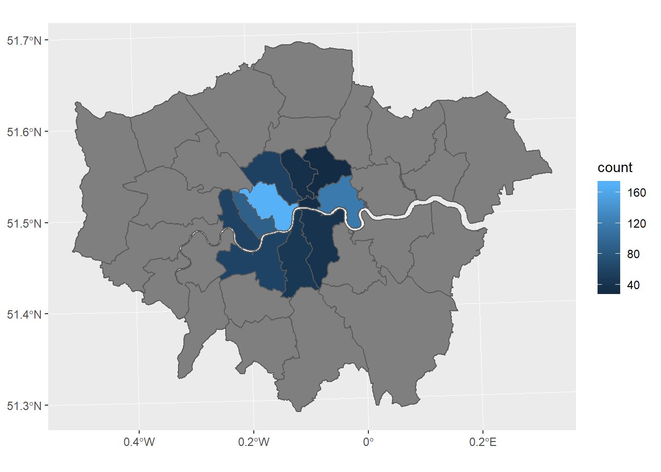
We can customize our map by adding thing to it. For example a viridis color scale (friendly to common forms of colorblindness).
g <- g +
  scale_fill_viridis_c(
    guide = guide_legend(title = "Hires") # legend title
  )
g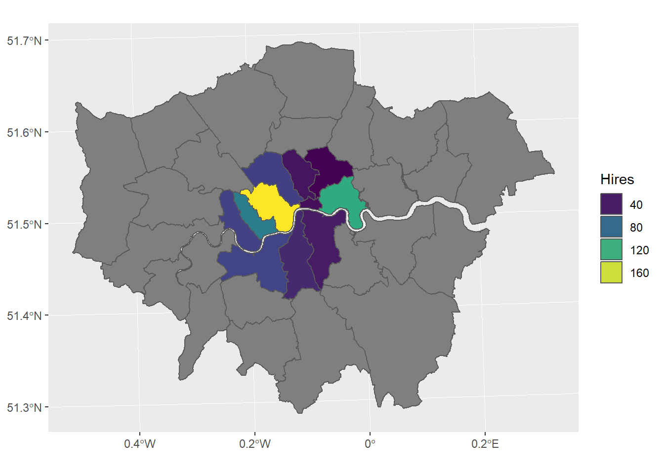
We can set a theme and add titles
g <- g +
  theme_bw() +
  ggtitle("Cycle hire points", subtitle = "in London's boroughs")
g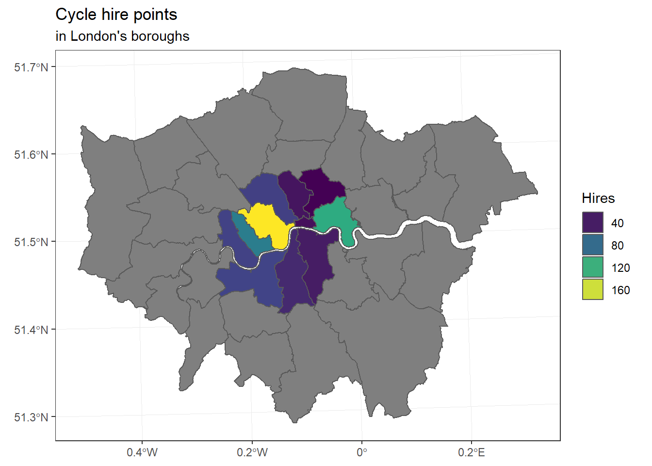
ggplot() +  geom_sf(data = london_boroughs_27700) + # add boroughs shape to the map
  geom_sf(data = boroughs_centroids_27700, # add the boroughs centroids>
          aes(size = boroughs_centroids_27700$count), # fix size of points (by area)
          color = 'red', alpha = 1/5)+ # set points colour and transparency
           ggtitle("Cycle hire points", subtitle = "in London's boroughs") + # set the map title
             theme(legend.position = 'left') + # Legend position
             scale_size_area(name = 'Hires',max_size=10) # 0 value means 0 area + legend title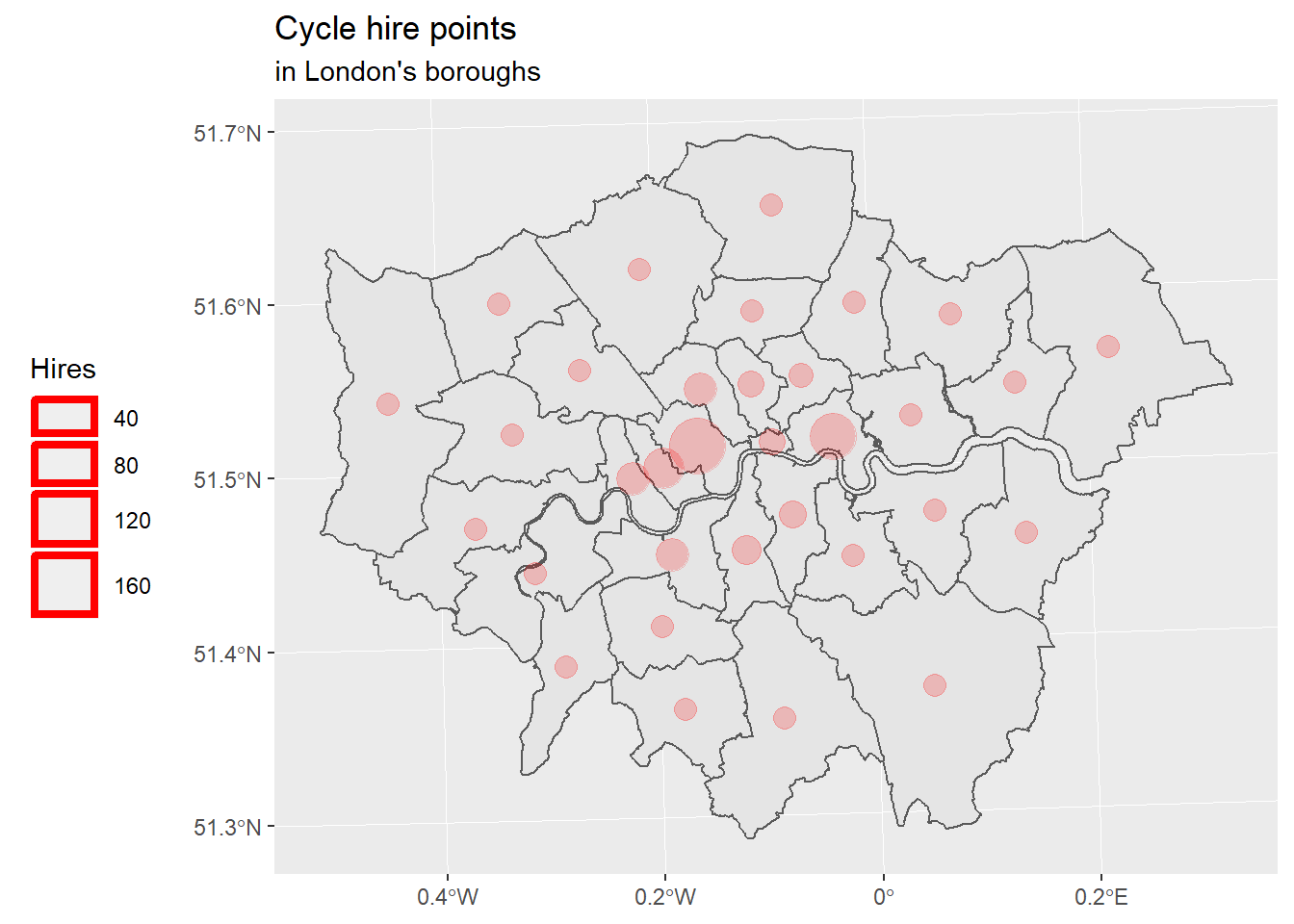
Well, the legend is not convincing me.Although it should work like in the OSGeoLive R Quickstart.
And if we want to had decorations (scale bar, north arrow), we need to use a another package: {ggspatial}.
Now, let’s use proper packages for cartography. First {tmap} who was created before {ggplot} was able to do maps with {sf} objects. Then {cartography} who is a based on plot() from base R.
5.4 Using {tmap}
{tmap} was created to help people mapping when {ggplot2} was not able to plot {sf} objects3
library(tmap)

tm_shape(london_boroughs_27700) +
    tm_polygons("count")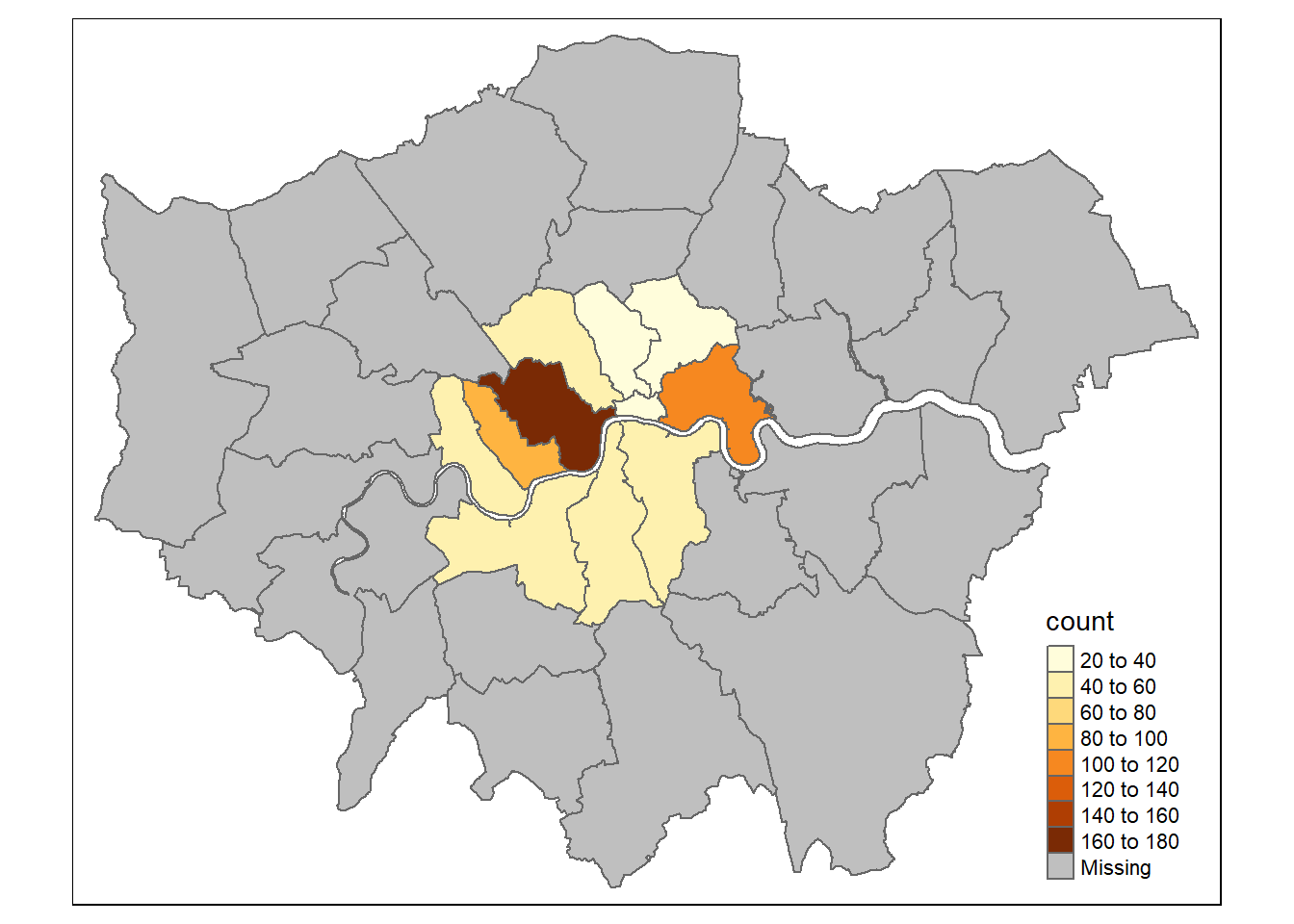
We can see that there is a color scale for the quantity of hire points.
One cool thing with {tmap}, it is that you can use 2 modes: “plot” and “view”. The “view” mode is an interactive one ! Try to go over or click on polygons !
tmap_mode("view")

tm_shape(london_boroughs_27700) +
    tm_polygons("count")
You can do more complex thing of course, like side by side maps or calculations.
tmap_mode("plot")

tm1 <- tm_shape(london_boroughs_27700) + tm_polygons("count", convert2density = TRUE)
tm2 <- tm_shape(london_boroughs_27700) + tm_bubbles(size = "count")

tmap_arrange(tm1, tm2)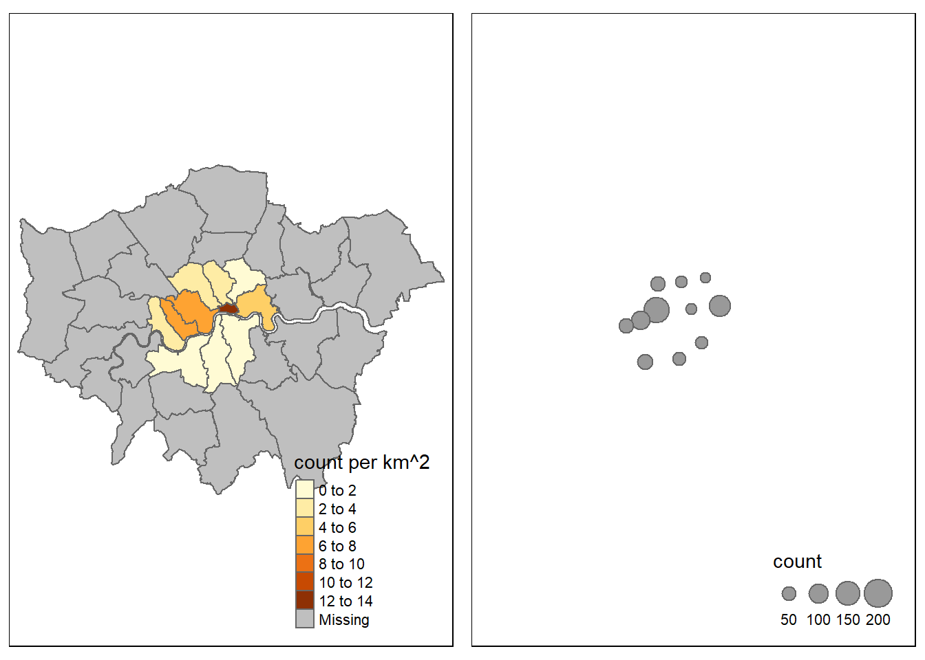
Let’s represent 2 layers in the same time :
tmap_mode("view")
tm_basemap("Stamen.Watercolor") +
tm_shape(london_boroughs_27700) + tm_polygons("count", convert2density = TRUE) + tm_bubbles(size = "count", col = "red") +
tm_tiles("Stamen.TonerLabels")
Now we can add decorations.
tmap_mode("plot")

tm_shape(london_boroughs_27700) +
  tm_polygons("count", convert2density = TRUE) +
  tm_bubbles(size = "count", col = "red") +
  tm_scale_bar(position=c("left", "bottom")) +
  tm_compass(size = 2, position=c("right", "top"))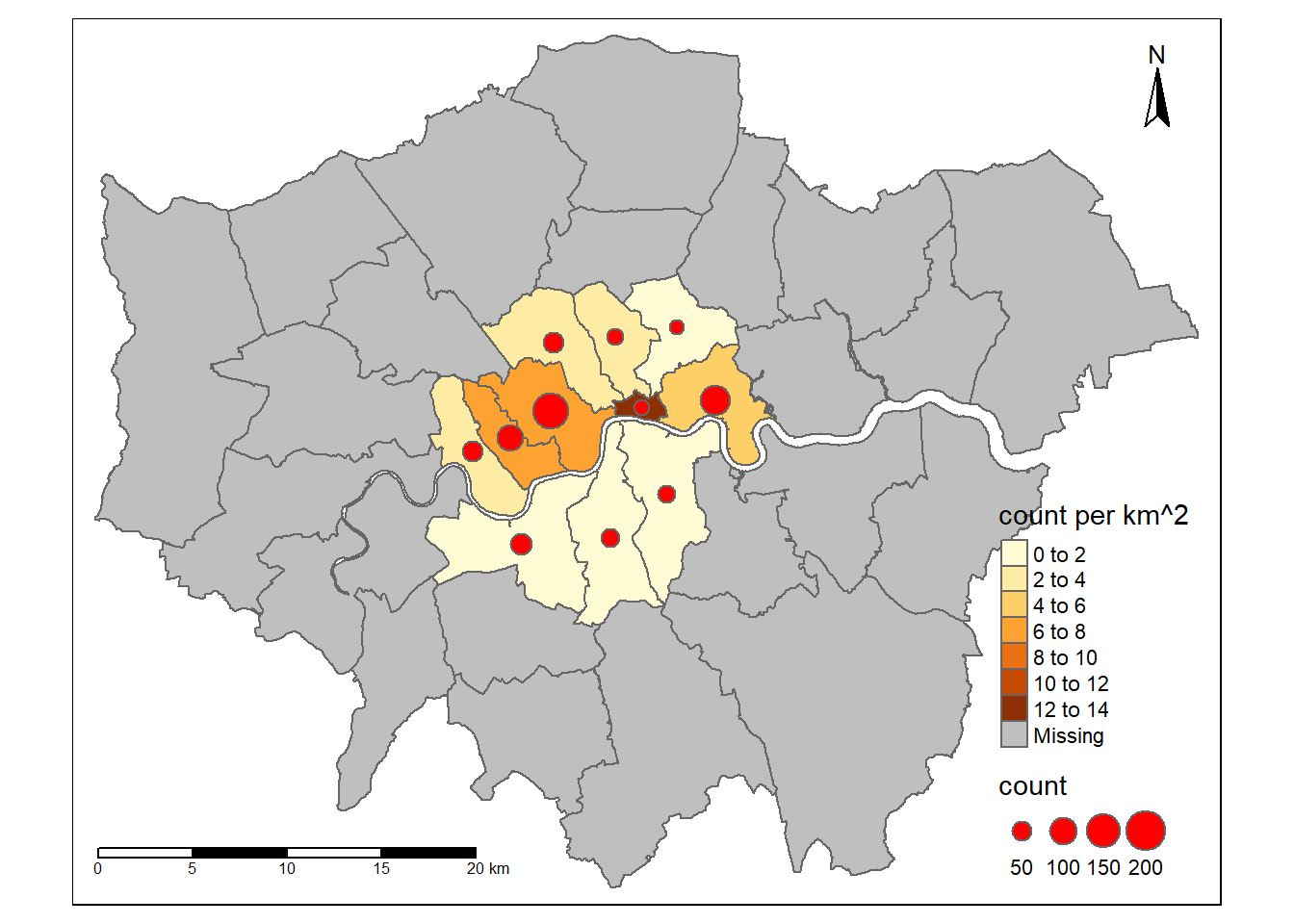
You can place elements more precisely by giving them position coordinates.
5.5 With {cartography}
If you want to do maps in R, please take a look at {cartography}. It is thought for doing maps and is made by geographers. The package vignette is very well made and provides 11 examples to cover a lot of use cases.
This is one example:
library(cartography)

# Plot the boroughs
plot(st_geometry(london_boroughs_27700), col="darkseagreen3", border="darkseagreen4",
     bg = "lightblue1", lwd = 0.5)
# Plot symbols with choropleth coloration
propSymbolsChoroLayer(
  x = london_boroughs_27700,
  var = "sum",
  inches = 0.1,
  border = "grey50",
  lwd = 1,
  legend.var.pos = "topright",
  legend.var.title.txt = "Total bike hires",
  var2 = "count",
  method = "equal",
  nclass = 4,
  col = carto.pal(pal1 = "sand.pal", n1 = 4),
  legend.var2.values.rnd = -2,
  legend.var2.pos = "left",
  legend.var2.title.txt = "Number of hire points"
)
# layout
layoutLayer(title="Bike hires in London boroughs",
            author = "Nicolas Roelandt, FOSS4G 2019",
            sources = "Sources: spData R package, 2019",
            scale = 5, tabtitle = TRUE, frame = FALSE)
# north arrow
north(pos = "topleft")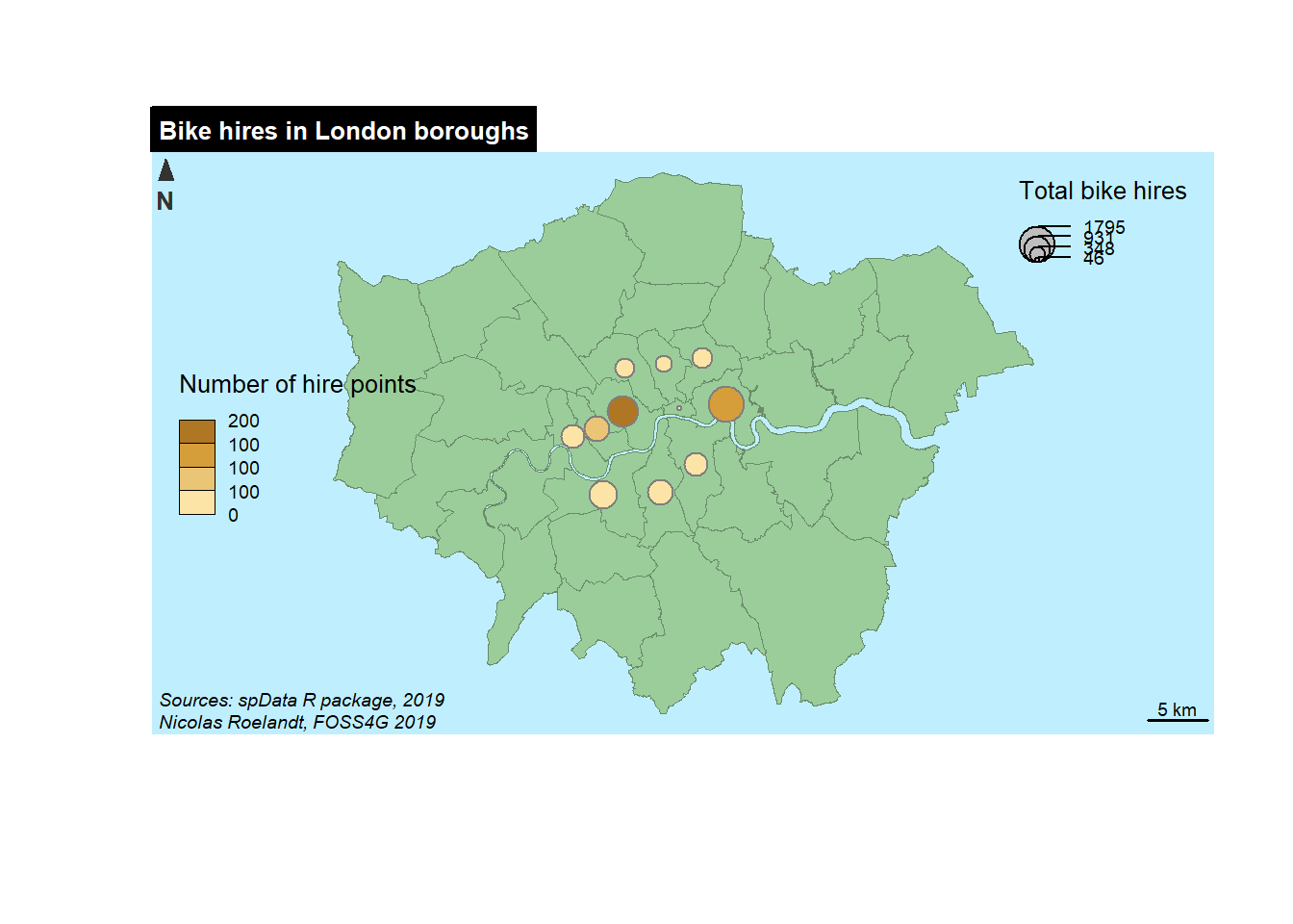
This is a more complex object but we can detail it. First we create a plot of the background, the boroughs of London in green with a light blue background.
Then we add a propSymbolsChoroLayer() who is a choroplet layer with proportionnal symbols (you can have more simple items, see the documentation). SO we need to specify 2 variables on for the symbol size (here we choose sum) and one for the color of the symbols. For each variable we provides some complementary parameters (color palette, classification method, title of the legend, etc.).
{cartography} also provides a layout function for the map where you can insert more information : author name, date, sources, map title, position and type of the scale bar, etc.).
Last but not least you can add a north arrow with the north() function.
References
Wickham, Hadley. 2010. “A Layered Grammar of Graphics.” Journal of Computational and Graphical Statistics 19 (1): 3–28. https://doi.org/10.1198/jcgs.2009.07098.
That arrived in 2018 with the 3.0 release : https://www.tidyverse.org/articles/2018/07/ggplot2-3-0-0/↩